CityFALCON is a fintech platform for curated market news and portfolios. Watchlists were under-used and early personalization wasn’t driving behavior. I owned end-to-end product design for onboarding redesign and watchlist management, transforming how users first experience and return to the platform.
CityFALCON had built a powerful platform for financial professionals, but we had a classic fintech problem: users would sign up, explore briefly, then disappear. Our existing onboarding focused on preference collection rather than value demonstration.
The Stakes: With customer acquisition costs rising and premium conversion rates flat, we needed to prove that better onboarding could drive measurable business outcomes without additional marketing spend.
Key Business Insight: Analytics showed that users who actively used watchlists had 3x higher premium conversion likelihood, and pricing page visits often happened immediately after watchlist interactions. But most users never discovered or engaged with watchlists.
Timeline
Jan-Apr 2023
Product Designer (end-to-end)
Web + iOS
PM + Engineering + Analytics
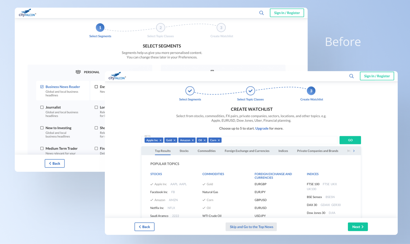
Our onboarding treated watchlist creation as an optional final step, but data showed it was actually the key to retention and monetization.
Core Issues Discovered:
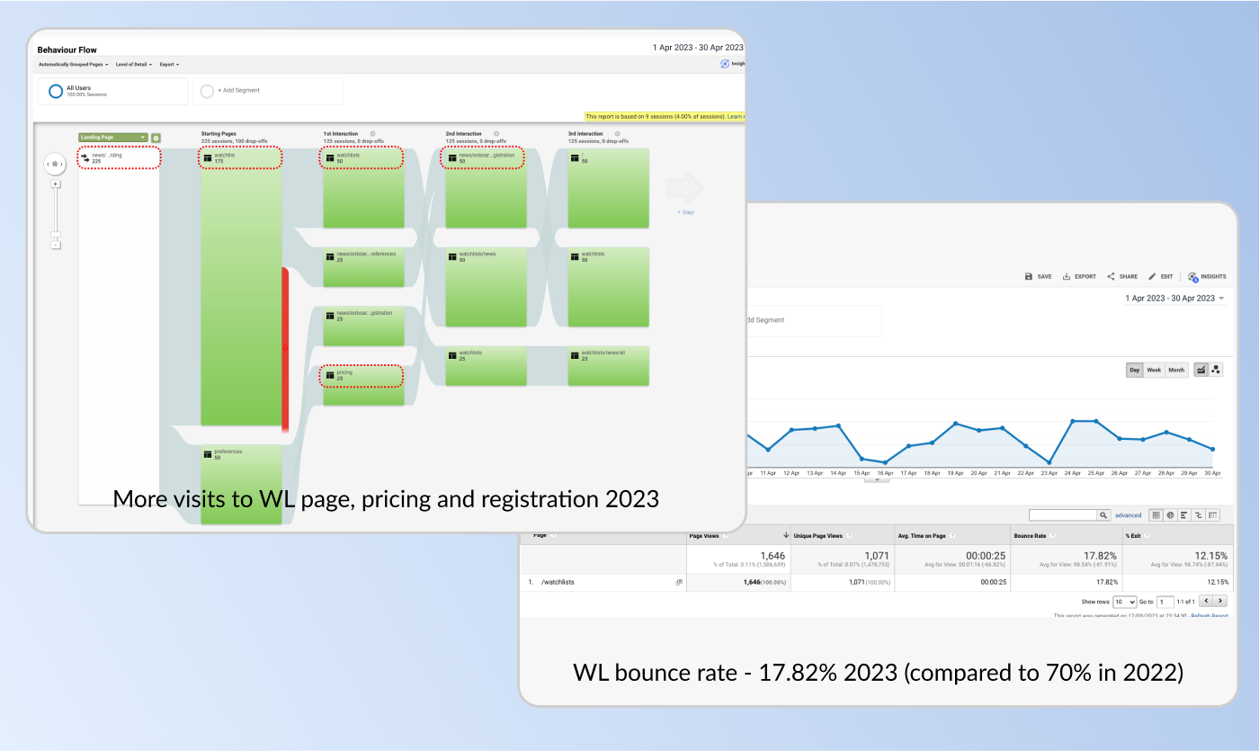
The Data Story:Through analytics, user feedback, and session replays, we uncovered that activation was "leaking" at the moment users should have been seeing value. Users would complete setup steps but bounce before creating anything meaningful.
We analysed analytics, user feedback, and session replays to uncover:
Our bet:
If we introduce watchlist creation as the first step (not the last), trim preferences to only what affects the immediate experience, and create multiple obvious access points, activation and retention should improve significantly.
Why This Approach:
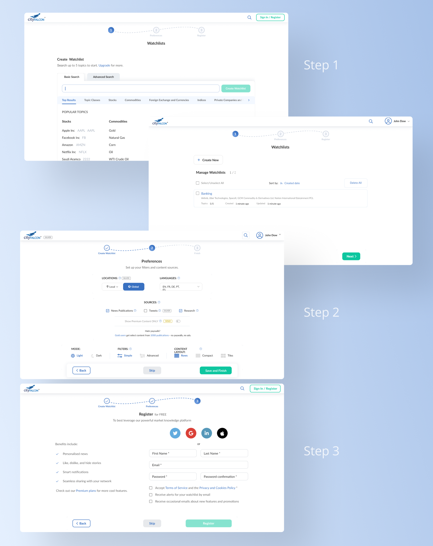
1. Reordered User Journey
2. Multi-Platform Consistency
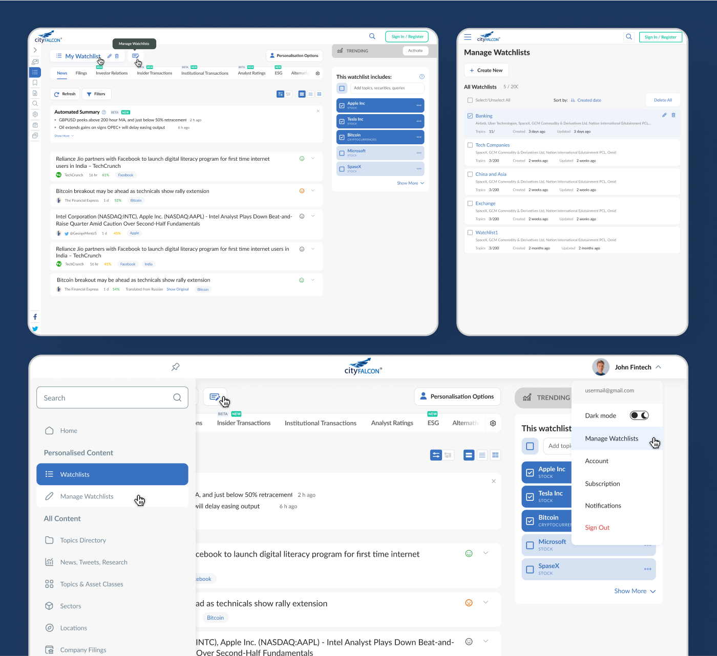
3. Enhanced Access & Return Experience
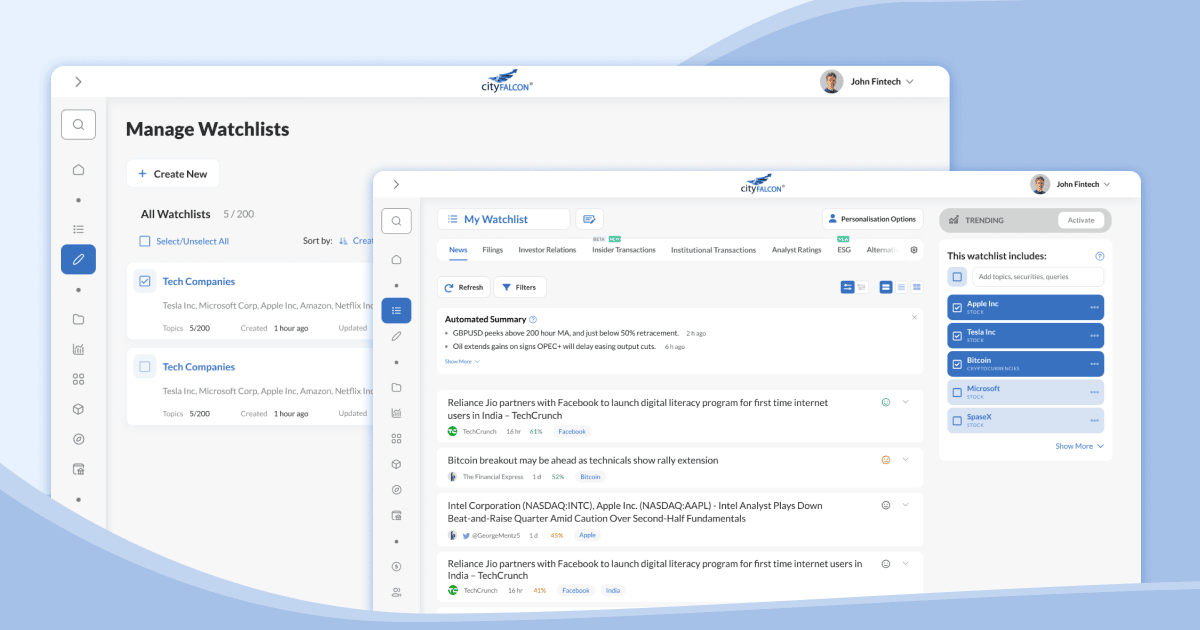
4. Improved Watchlist Management Interface
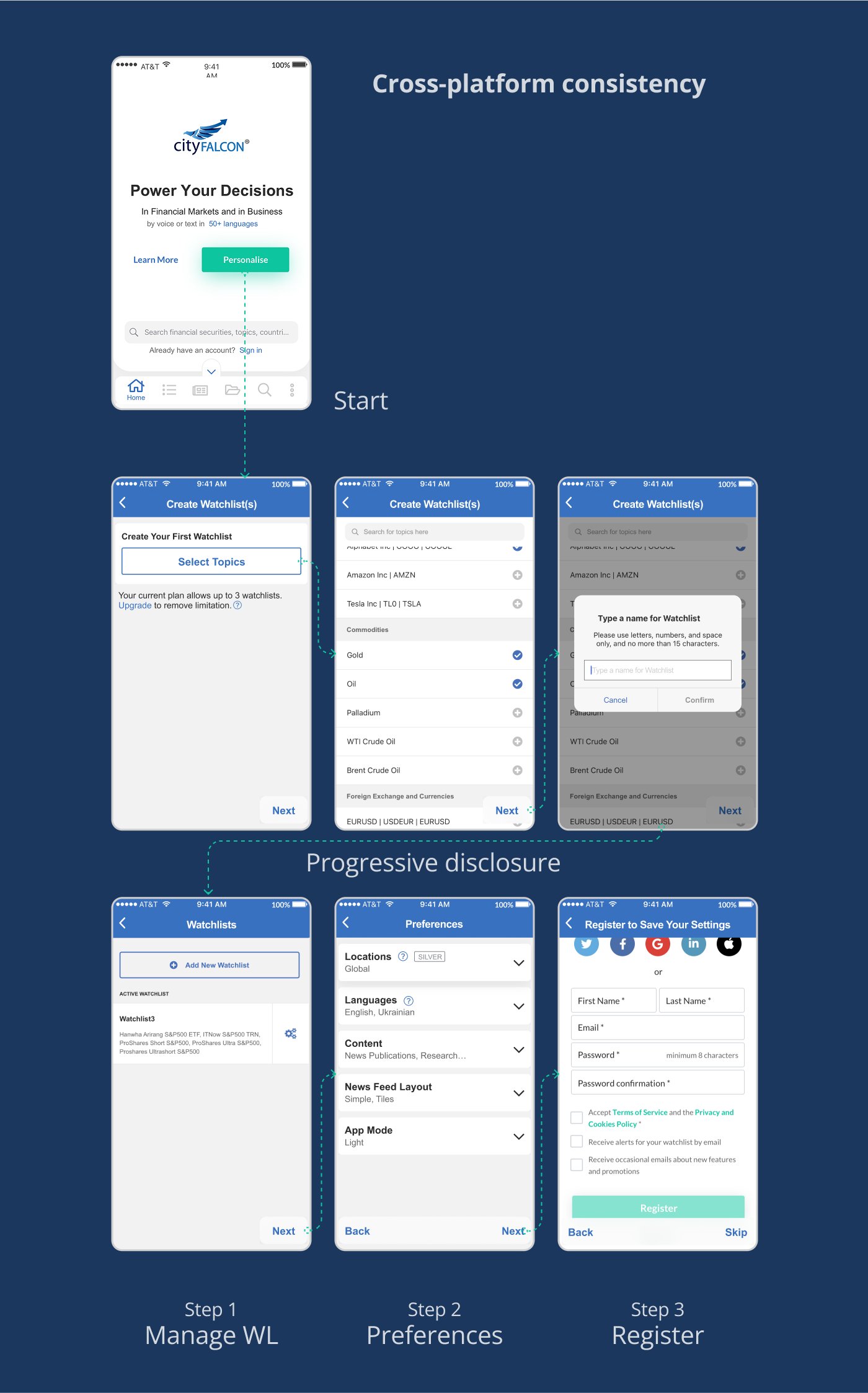
Progressive disclosure. 3 lean steps drive a tangible first outcome (a usable watchlist).
Access points. Entry from feed tile, leftbar, and account—reduce time-to-return.
Web first; aligned iOS to ship consistently.
Cross-Platform Complexity:
Had to balance web-first design with iOS native patterns while maintaining feature parity. Worked closely with iOS developer to ensure interactions felt natural on both platforms without diluting the experience.
Performance vs. Polish Trade-offs:
Initial designs included more sophisticated animations, but performance testing showed delays affected completion rates. Chose subtle transitions that enhanced usability without impacting load times.
Stakeholder Alignment Challenge:
Marketing wanted to collect extensive user data upfront, but user testing clearly showed preference fatigue led to abandonment. Had to build the case that less data collection initially would lead to more engaged users long-term.
Technical Constraint Navigation:
Backend limitations meant we couldn't implement real-time watchlist collaboration initially. Designed the interface to accommodate this future feature without over-engineering the current experience.
Phased Rollout Strategy:
Validation Loop:
Worked closely with PM and engineering to monitor user behaviour post-ship, then iterated on default settings and micro-interactions based on real usage patterns.
Cross-Platform Coordination:
Ensured web and iOS shipped with consistent user expectations, even when technical implementation differed between platforms.
Validation loop:
Iterated with PM/dev; reviewed behaviour post-ship and tuned the defaults.
Onboarding Performance:
Feature Adoption & Engagement:
Business Impact:
Systems Thinking Matters:
Designing linked flows (onboarding → feature usage → return behaviour) creates compounding engagement effects that isolated improvements can't achieve.
Small Changes, Big Impact:
Navigation placement and visual hierarchy improvements unlocked significant adoption increases, proving that strategic UI changes can drive measurable business outcomes.
Data-Driven Design Validation:
Using analytics to validate prioritisation decisions and measure real business outcomes makes design impact quantifiable and strategic.
Cross-Platform Collaboration:
Working closely with developers ensured scalable, responsive delivery that maintained design integrity across platforms.
Next Phase Opportunities:
CityFALCON is a fintech platform for curated market news and portfolios. Watchlists were under-used and early personalization wasn’t driving behavior. I owned end-to-end product design for onboarding redesign and watchlist management, transforming how users first experience and return to the platform.
CityFALCON had built a powerful platform for financial professionals, but we had a classic fintech problem: users would sign up, explore briefly, then disappear. Our existing onboarding focused on preference collection rather than value demonstration.
The Stakes: With customer acquisition costs rising and premium conversion rates flat, we needed to prove that better onboarding could drive measurable business outcomes without additional marketing spend.
Key Business Insight: Analytics showed that users who actively used watchlists had 3x higher premium conversion likelihood, and pricing page visits often happened immediately after watchlist interactions. But most users never discovered or engaged with watchlists.
Timeline
Jan-Apr 2023
Product Designer (end-to-end)
Web + iOS
PM + Engineering + Analytics
Our onboarding treated watchlist creation as an optional final step, but data showed it was actually the key to retention and monetization.
Core Issues Discovered:
The Data Story:Through analytics, user feedback, and session replays, we uncovered that activation was "leaking" at the moment users should have been seeing value. Users would complete setup steps but bounce before creating anything meaningful.
We analysed analytics, user feedback, and session replays to uncover:
Our bet:
If we introduce watchlist creation as the first step (not the last), trim preferences to only what affects the immediate experience, and create multiple obvious access points, activation and retention should improve significantly.
Why This Approach:
1. Reordered User Journey
2. Multi-Platform Consistency
3. Enhanced Access & Return Experience
4. Improved Watchlist Management Interface
Progressive disclosure. 3 lean steps drive a tangible first outcome (a usable watchlist).
Access points. Entry from feed tile, leftbar, and account—reduce time-to-return.
Web first; aligned iOS to ship consistently.
Cross-Platform Complexity:
Had to balance web-first design with iOS native patterns while maintaining feature parity. Worked closely with iOS developer to ensure interactions felt natural on both platforms without diluting the experience.
Performance vs. Polish Trade-offs:
Initial designs included more sophisticated animations, but performance testing showed delays affected completion rates. Chose subtle transitions that enhanced usability without impacting load times.
Stakeholder Alignment Challenge:
Marketing wanted to collect extensive user data upfront, but user testing clearly showed preference fatigue led to abandonment. Had to build the case that less data collection initially would lead to more engaged users long-term.
Technical Constraint Navigation:
Backend limitations meant we couldn't implement real-time watchlist collaboration initially. Designed the interface to accommodate this future feature without over-engineering the current experience.
Phased Rollout Strategy:
Validation Loop:
Worked closely with PM and engineering to monitor user behaviour post-ship, then iterated on default settings and micro-interactions based on real usage patterns.
Cross-Platform Coordination:
Ensured web and iOS shipped with consistent user expectations, even when technical implementation differed between platforms.
Validation loop:
Iterated with PM/dev; reviewed behaviour post-ship and tuned the defaults.
Onboarding Performance:
Feature Adoption & Engagement:
Business Impact:
Systems Thinking Matters:
Designing linked flows (onboarding → feature usage → return behaviour) creates compounding engagement effects that isolated improvements can't achieve.
Small Changes, Big Impact:
Navigation placement and visual hierarchy improvements unlocked significant adoption increases, proving that strategic UI changes can drive measurable business outcomes.
Data-Driven Design Validation:
Using analytics to validate prioritisation decisions and measure real business outcomes makes design impact quantifiable and strategic.
Cross-Platform Collaboration:
Working closely with developers ensured scalable, responsive delivery that maintained design integrity across platforms.
Next Phase Opportunities:


