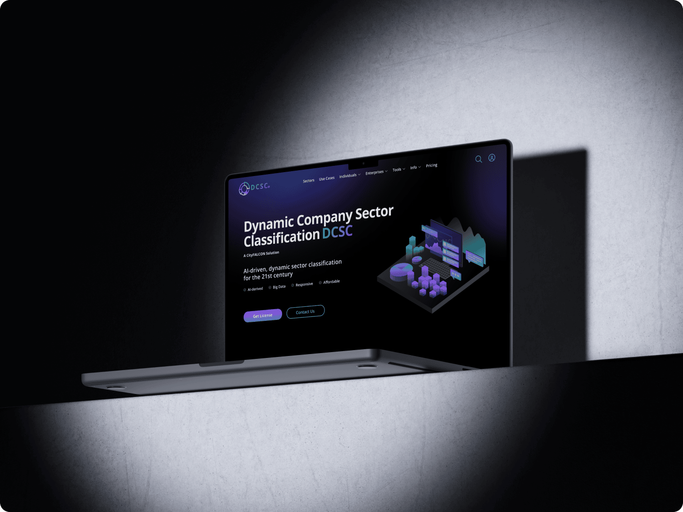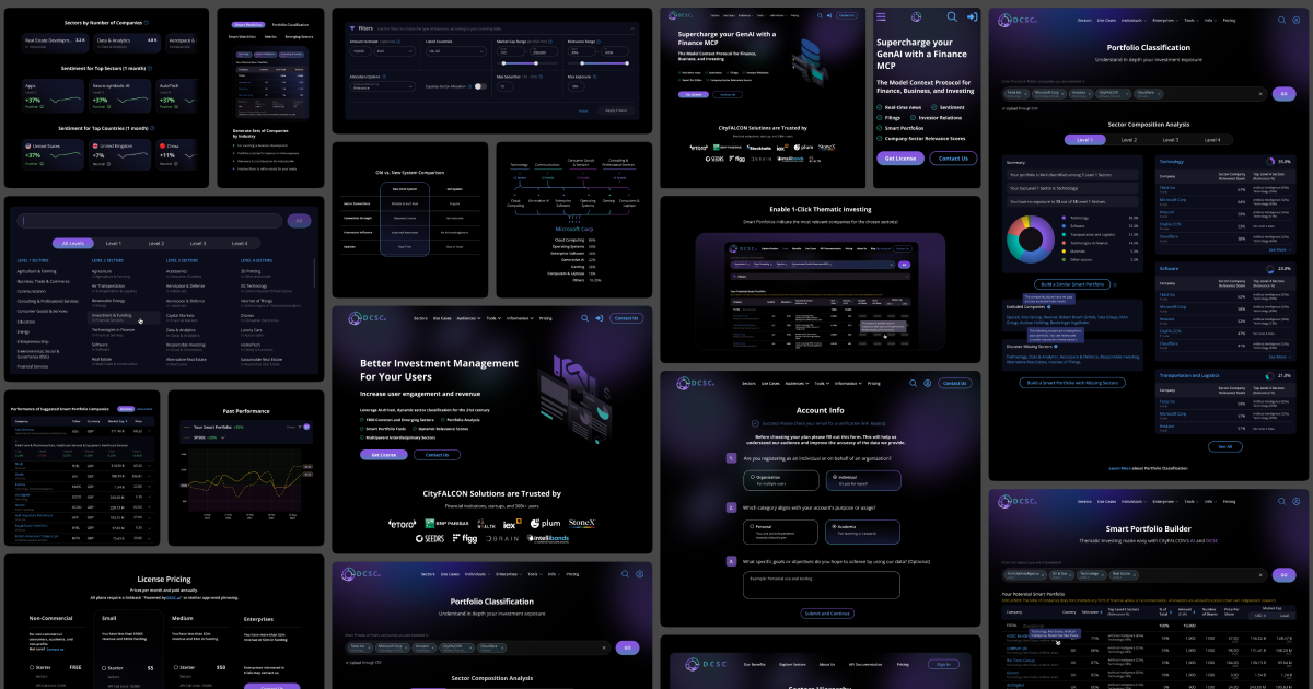
We built what we thought was a clever mousetrap – an ML-powered sector classification tool that would magnetically pull users from free exploration to paid CityFALCON subscriptions. 304 sessions and a 1.6% conversion rate later, we learned that in B2B, clever doesn't always mean commercial.
Timeline: 2024–2025 (pilot from concept to release)
Role: UX/Product Designer
Team: 3 designers + ML engineers + analysts + CEO/COO
Live Site: dcsc.ai
CityFALCON wanted to expand beyond news aggregation into classification and analytics. DCSC was our pilot to test whether ML-extracted sector data could attract new business clients – both individuals and enterprises.
The hypothesis seemed sound: Create a compelling free tool showcasing our ML capabilities, let users build smart watchlists, then convert them to CityFALCON subscribers. A classic "land and expand" play.
The challenge: Users struggled with abstract AI classifications, and our existing platform had no clear entry points for this advanced data. The journey from landing page to meaningful value felt fragmented and slow.
Client Goals:
Sector classification felt like a black box. Users couldn't understand what our ML was actually doing or why they should care. The path from "interesting tool" to "valuable insight" was broken.
Core Issues:
User Frustration: "I can see this tool classifies companies, but I don't understand how it helps my investment decisions."
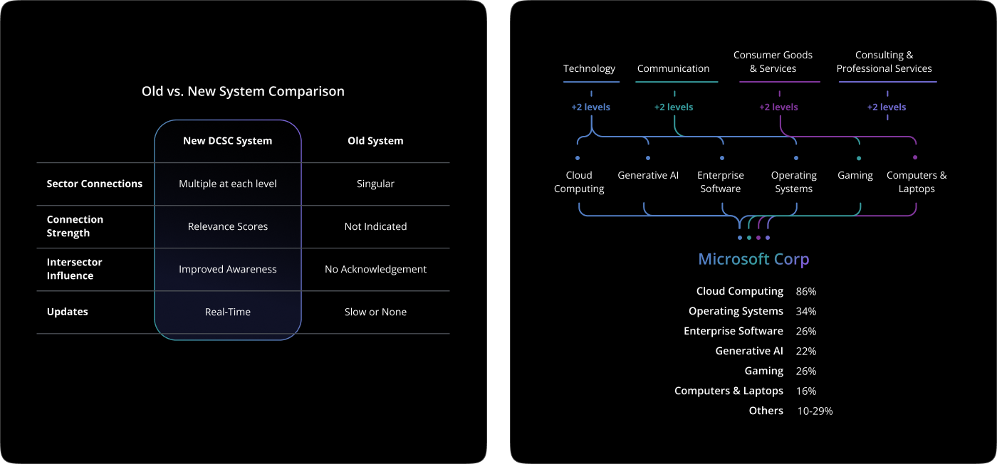
Our hypothesis: A cohesive user journey supported by example-first explanations and streamlined navigation would accelerate onboarding, improve engagement, and validate market demand.
If we could:
Then users would: Reach "first value" faster, engage more deeply with the platform, and convert to CityFALCON at higher rates.
Success Framework: Attract → Activate → Engage → Retain → Expand

I led the design transformation from concept through launch, working initially with 2 other UX/UI designers, then owning the entire pilot lifecycle.
1. Example-First UI

2. Multi-Audience Landing Pages
3. Streamlined User Flow
4. Multi-Level Sector Hierarchy & Navigation
5. Active Engagement Over Passive Classification

A short list of the scope of my involvement in the project:
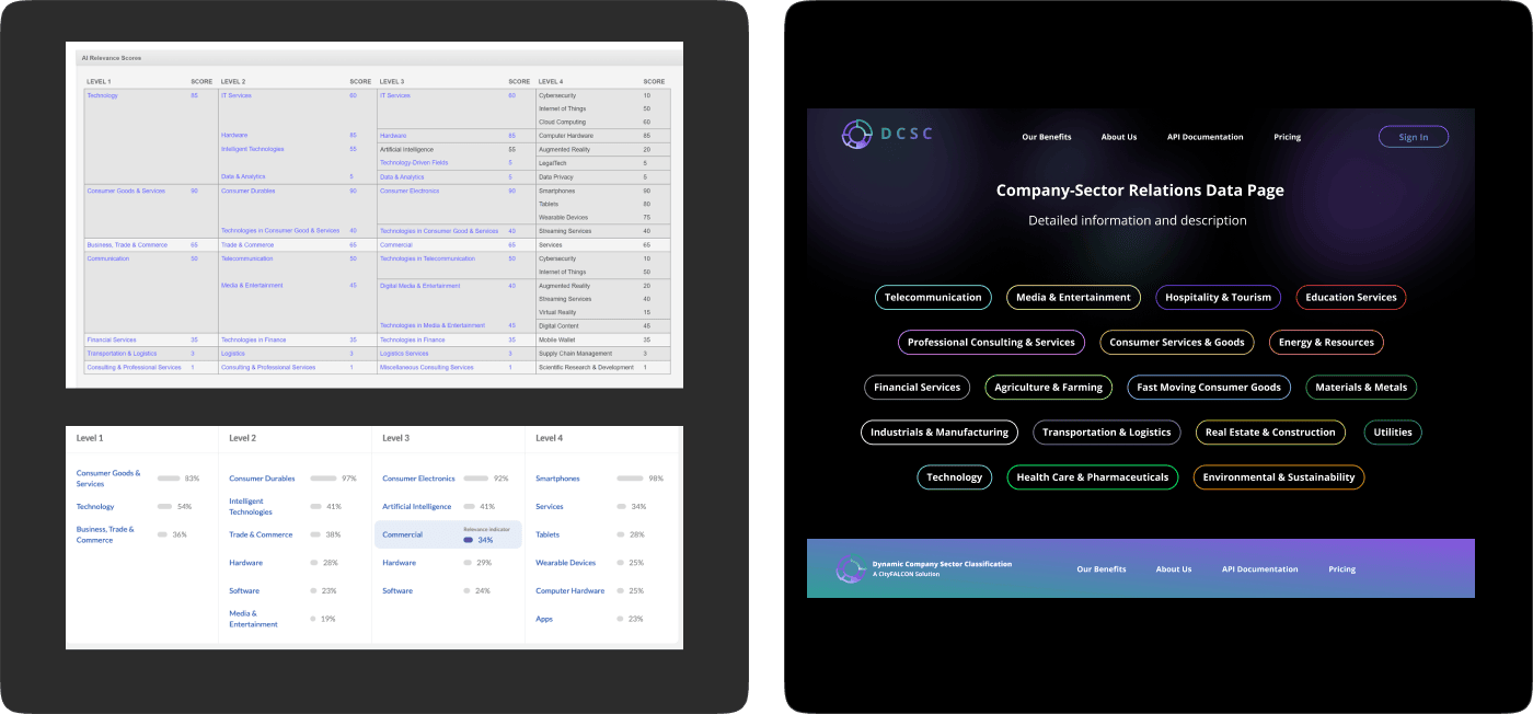
Defined comprehensive design system including typography, component logic, and custom illustrations to ensure clarity and accessibility across complex financial data visualizations.
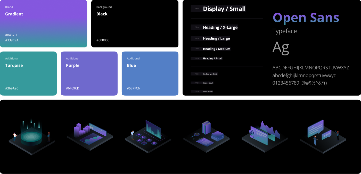
Deliverables spanned acquisition, engagement, onboarding, and data tools.
Acquisition Layer:
Core Product:
Supporting Infrastructure:

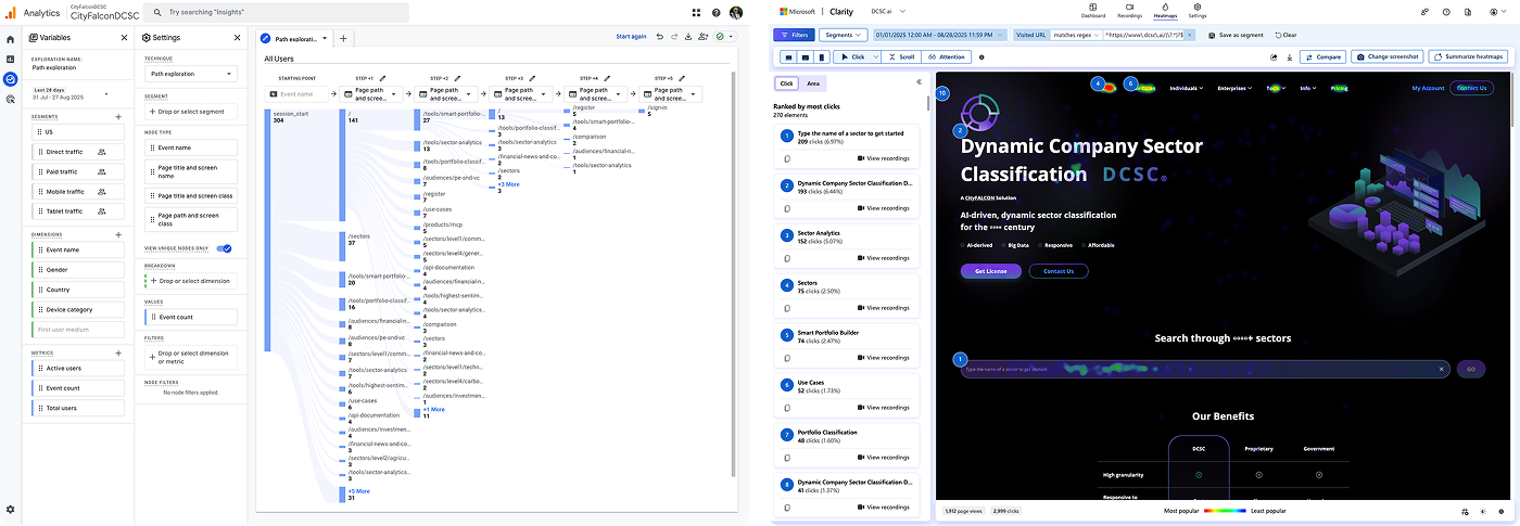
The Good News:
The Brutal Reality:
Key Insight:
Attraction ≠ Activation. Users were curious but not compelled.
Tools Used:
GA4 (path exploration), Microsoft Clarity (scroll & click tracking)
Metrics Tracked:
Entry pages, funnel drop-offs, CTA clicks, scroll depth, conversion paths
I learned that great entry UX doesn’t matter if you hide the “aha” moment too far down. Funnels don’t lie — users will drop off if value isn’t immediate and the next step isn’t obvious. While Smart Portfolio Builder was our strongest attractor, only ~1.5% of sessions converted to register. We redesigned CTAs and onboarding to reduce drop-offs.
Pilot validated demand for tool oriented features; informed pivot toward business-oriented offerings.
What the data taught us:
Great entry UX doesn't matter if you hide the "aha" moment too far down the funnel. Users will drop off if value isn't immediate and the next step isn't obvious.
The strategic pivot:
The low conversion rates weren't just a UX problem – they revealed a fundamental go-to-market mismatch. Individual users were curious but not compelled to pay for sector insights. This drove a complete strategy shift from self-serve acquisition to enterprise sales demonstrations.
Immediate Improvements Made:
Strategic Recommendations:
Business Impact:
While DCSC didn't achieve the original acquisition goals, it validated demand for enterprise-focused classification tools and informed CityFALCON's pivot toward B2B API sales – ultimately leading to more qualified enterprise conversations and a clearer product-market fit strategy.


We built what we thought was a clever mousetrap – an ML-powered sector classification tool that would magnetically pull users from free exploration to paid CityFALCON subscriptions. 304 sessions and a 1.6% conversion rate later, we learned that in B2B, clever doesn't always mean commercial.
Timeline: 2024–2025 (pilot from concept to release)
Role: UX/Product Designer
Team: 3 designers + ML engineers + analysts + CEO/COO
Live Site: dcsc.ai
CityFALCON wanted to expand beyond news aggregation into classification and analytics. DCSC was our pilot to test whether ML-extracted sector data could attract new business clients – both individuals and enterprises.
The hypothesis seemed sound: Create a compelling free tool showcasing our ML capabilities, let users build smart watchlists, then convert them to CityFALCON subscribers. A classic "land and expand" play.
The challenge: Users struggled with abstract AI classifications, and our existing platform had no clear entry points for this advanced data. The journey from landing page to meaningful value felt fragmented and slow.
Client Goals:
Sector classification felt like a black box. Users couldn't understand what our ML was actually doing or why they should care. The path from "interesting tool" to "valuable insight" was broken.
Core Issues:
User Frustration: "I can see this tool classifies companies, but I don't understand how it helps my investment decisions."

Our hypothesis: A cohesive user journey supported by example-first explanations and streamlined navigation would accelerate onboarding, improve engagement, and validate market demand.
If we could:
Then users would: Reach "first value" faster, engage more deeply with the platform, and convert to CityFALCON at higher rates.
Success Framework: Attract → Activate → Engage → Retain → Expand

I led the design transformation from concept through launch, working initially with 2 other UX/UI designers, then owning the entire pilot lifecycle.
1. Example-First UI

2. Multi-Audience Landing Pages
3. Streamlined User Flow
4. Multi-Level Sector Hierarchy & Navigation
5. Active Engagement Over Passive Classification

A short list of the scope of my involvement in the project:

Defined comprehensive design system including typography, component logic, and custom illustrations to ensure clarity and accessibility across complex financial data visualizations.

Deliverables spanned acquisition, engagement, onboarding, and data tools.
Acquisition Layer:
Core Product:
Supporting Infrastructure:


The Good News:
The Brutal Reality:
Key Insight:
Attraction ≠ Activation. Users were curious but not compelled.
Tools Used:
GA4 (path exploration), Microsoft Clarity (scroll & click tracking)
Metrics Tracked:
Entry pages, funnel drop-offs, CTA clicks, scroll depth, conversion paths
I learned that great entry UX doesn’t matter if you hide the “aha” moment too far down. Funnels don’t lie — users will drop off if value isn’t immediate and the next step isn’t obvious. While Smart Portfolio Builder was our strongest attractor, only ~1.5% of sessions converted to register. We redesigned CTAs and onboarding to reduce drop-offs.
Pilot validated demand for tool oriented features; informed pivot toward business-oriented offerings.
What the data taught us:
Great entry UX doesn't matter if you hide the "aha" moment too far down the funnel. Users will drop off if value isn't immediate and the next step isn't obvious.
The strategic pivot:
The low conversion rates weren't just a UX problem – they revealed a fundamental go-to-market mismatch. Individual users were curious but not compelled to pay for sector insights. This drove a complete strategy shift from self-serve acquisition to enterprise sales demonstrations.
Immediate Improvements Made:
Strategic Recommendations:
Business Impact:
While DCSC didn't achieve the original acquisition goals, it validated demand for enterprise-focused classification tools and informed CityFALCON's pivot toward B2B API sales – ultimately leading to more qualified enterprise conversations and a clearer product-market fit strategy.
