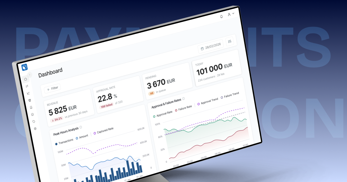
A payment gateway with a back office attached. Three roles hold different rights over the same money — super admin, tenant admin, tenant finance — plus the merchant.
The work spanned the dashboard, the accounting module (invoices, settlements, pricing configuration, balance reports, credit notes, fee allocation, email templates), the notification system, and the customer-facing deposit and withdrawal flows.
Role
Senior Product Designer — sole designer on the module
Team
CTO, backend team, internal finance users
Timeline
Nov 2025 – Jul 2026
Client
Name withheld
Nothing said what mattered. Row actions, system messages and amounts all carried identical weight. The page had no opinion about why you had opened it. The amount — the only number anyone came for — competed with four exposed icon buttons, a menu on every column header and an amber status dropdown.
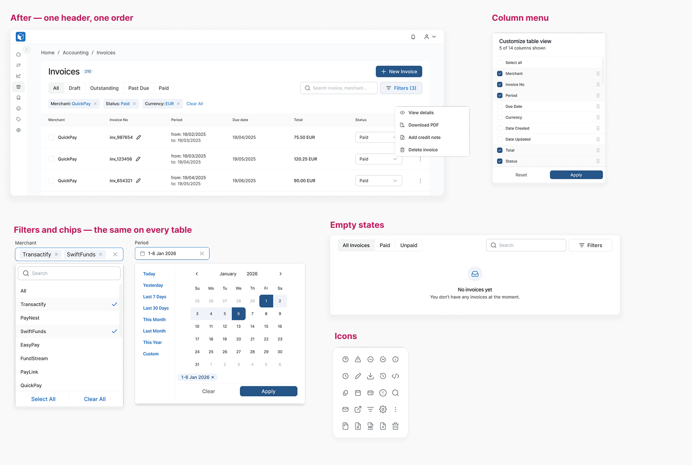
Competing patterns. Invoices had a bespoke filter card. Settlements used merchant multi-select tags. Balance reports used a drawer. Same job, three answers, and every new feature added a fourth.
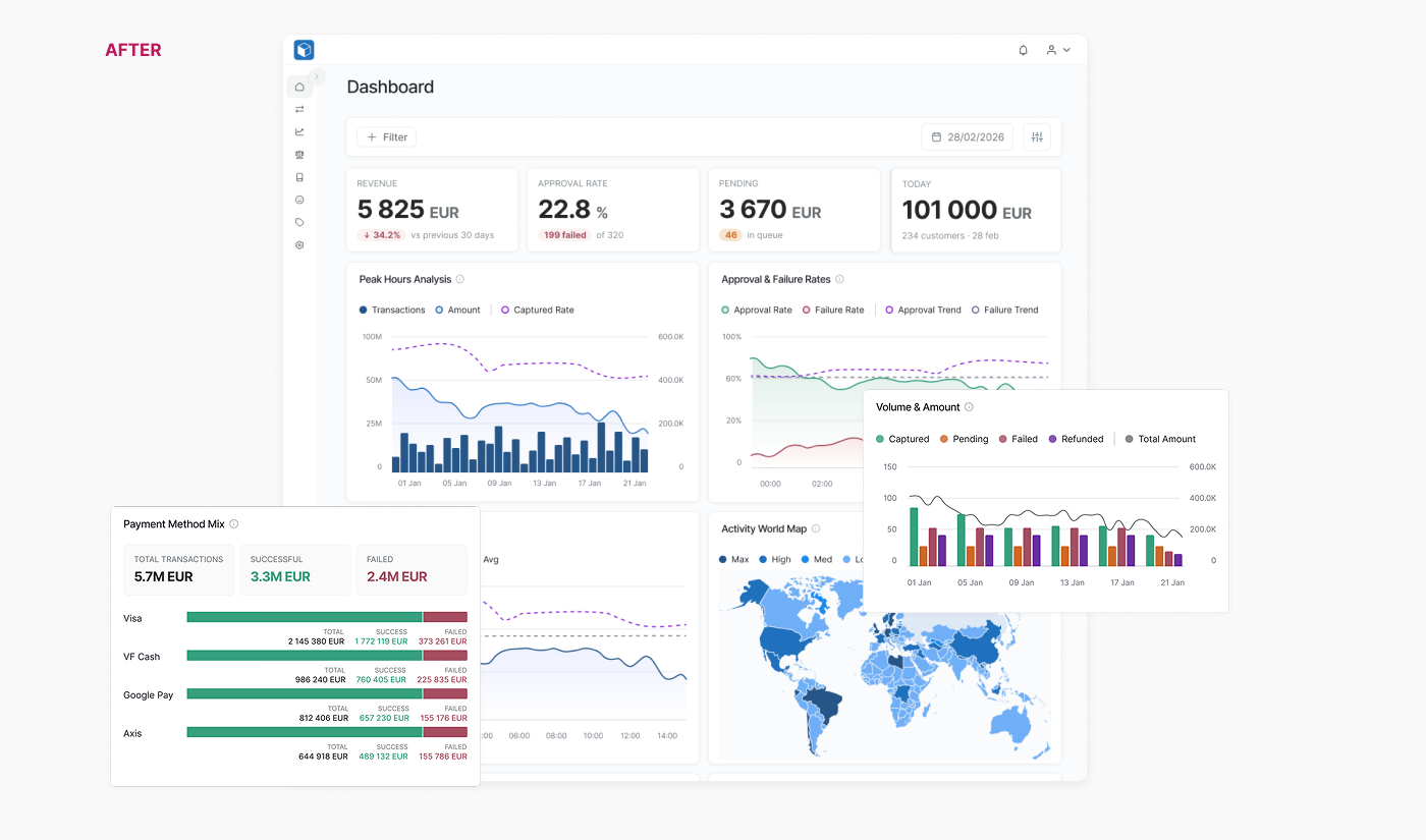
Colour carried no meaning. Purple applied filters, grey reset them, green generated an invoice. On the dashboard, red and green ran as chart series in a product where red already meant failed and green meant captured. The same status could appear in four colours across four widgets.
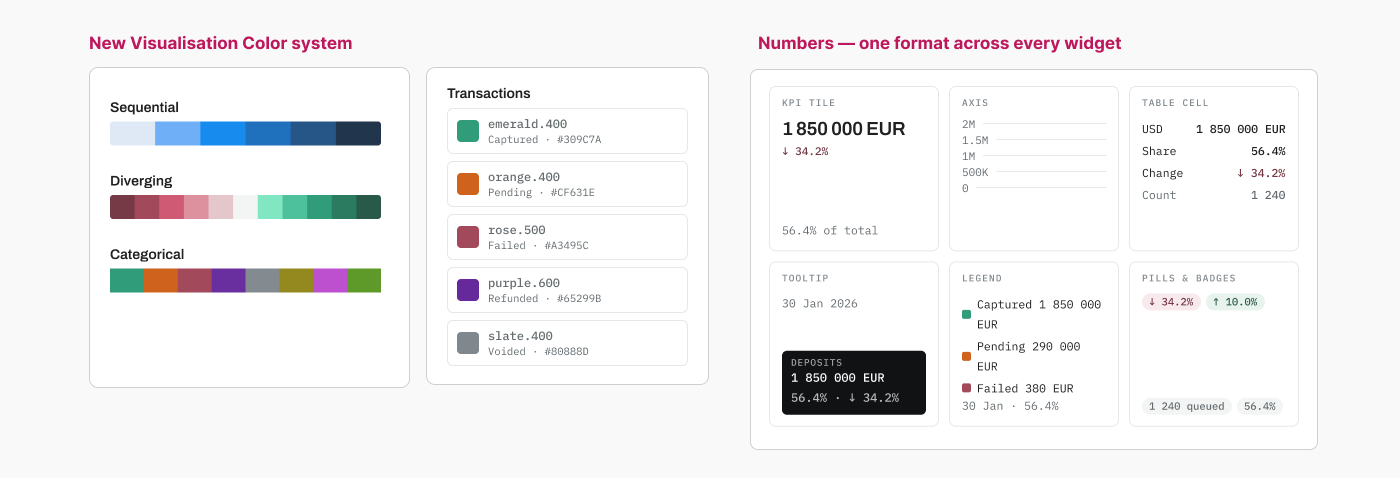
The numbers disagreed with each other. Currency symbols in a multi-currency platform. Two decimals in one card, none in the next. Deltas with no sign. One month-on-month figure printed as 1005.88% and nobody had blinked.
Events and money looked alike. A status change, a log line and a settled amount shared one visual voice. For people who reconcile money for a living, that ambiguity is the expensive kind.
The clearest symptom: four lines of instructions sat above the invoice table explaining which fields were editable, what the processing badge meant and how to merge PDFs. When a screen needs a manual printed on it, it has already failed.
Two patterns and one contract — not eight redesigned pages.
Everything else depends on this, so it came first.
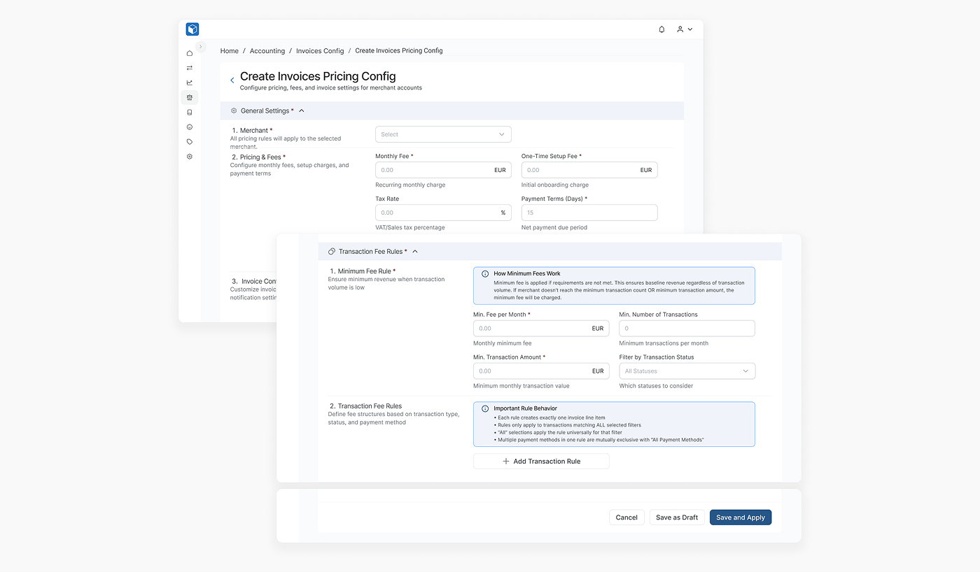
Pricing configuration decides what a merchant is charged — fees, tax, payment terms, transaction rules. Getting it wrong costs real money, so the form had to teach while it was being filled in.
Two later pieces of work tested whether the approach actually scaled.
Integrations. Merchants ask for the payment methods their own customers use, and every provider arrives with its own fields, verification steps and mandatory disclosure text. Each integration looked bespoke. None of them were — they're the same components rearranged: method selector, amount with currency, provider hand-off, pending, confirmation, failure, retry. Where a provider needs something extra — an IBAN, an extra consent line — it becomes a variant of a component that already exists rather than a fork in the flow. The next integration is an assembly job, not a project.
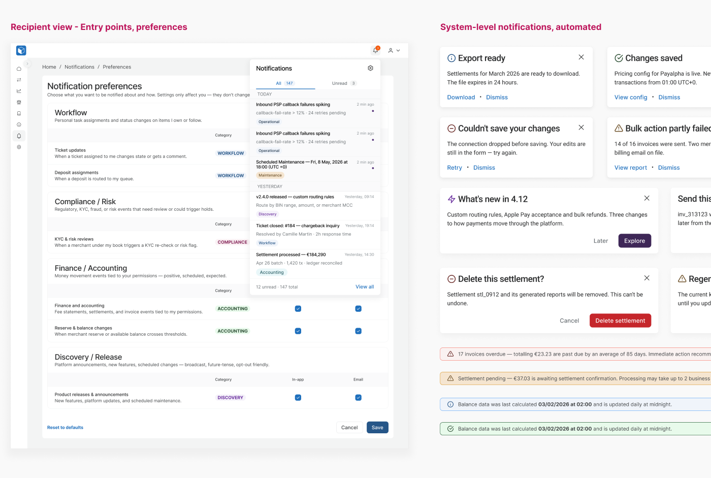
Notifications. The ask was one feature: let an admin send a message to every user. Building it exposed the real problem — notifications had accumulated in four unrelated places with no logic to which was which. I resolved it with three patterns (banner, modal, flag), a six-question rule for choosing between them, and 31 use cases specified against that rule across five categories. Severity and pattern became separate axes, because conflating them was what produced the original mess.
Start from the pattern, not the page. Fixing eight pages one at a time produces eight more patterns. Fixing the pattern once and applying it is the only version that holds after you leave.
Explain in place. If a rule is non-obvious, the explanation belongs beside the field, not behind a help icon. Those four instruction lines above the old table were the right instinct in the wrong location.
Two visual registers, kept apart. Financial values are typographic — tabular, right-aligned, ISO code, never coloured for decoration. System events are chips and log rows — never right-aligned, never in the numeric style, always timestamped with a timezone. Colour on a number only ever means direction. Colour on a chip only ever means state.
Split by rights, not by hiding. Merchants read invoices; tenants manage them. Rather than conditionally hiding controls inside one page, the merchant gets a simpler top-level Invoices page — no create, no edit, no delete. Fewer permission branches to maintain, and neither audience sees a screen designed around someone else's job.
Define components by property, not by drawing them. The button resolves to 320 combinations from four properties; the input to 144 from four more. Making Link and Destructive hierarchies rather than separate components means a text-link action inherits the same sizes, icon slots and states as every other button — so it can't drift, and a new case is a selection rather than a new artboard.
Write the rule down. Patterns that live only in a Figma file get re-invented by the next feature. The number formatting guide, the colour role definitions and the notification decision rule exist as documents and tokens so the decisions outlive the handoff.
Shipped: the dashboard rebuild, the list pattern across the accounting module, the pricing configurator, and multiple payment flows.
Full notification framework, signed off and built. Three patterns, one decision rule, 31 cases. The rule matters more than the cases — it's what resolves the ones nobody has listed yet.
Events and money, fully separated. Moving status history and settlement logs out of tabs and into a side panel over the record, so the history stays on screen while you read the thing it describes.
Tokens adopted everywhere. The formatting and colour-role tokens are defined but not yet adopted across the older pages. Until they are, the rule is a document rather than a constraint.
What I'd measure. Time to issue a settlement. Edits per invoice before it's correct. Support requests asking what an invoice status means. All three are countable, and none of them were being counted.
Thanks for reading!
A payment gateway with a back office attached. Three roles hold different rights over the same money — super admin, tenant admin, tenant finance — plus the merchant.
The work spanned the dashboard, the accounting module (invoices, settlements, pricing configuration, balance reports, credit notes, fee allocation, email templates), the notification system, and the customer-facing deposit and withdrawal flows.
Role
Senior Product Designer — sole designer on the module
Team
CTO, backend team, internal finance users
Timeline
Nov 2025 – Jul 2026
Client
Name withheld
Nothing said what mattered. Row actions, system messages and amounts all carried identical weight. The page had no opinion about why you had opened it. The amount — the only number anyone came for — competed with four exposed icon buttons, a menu on every column header and an amber status dropdown.
Competing patterns. Invoices had a bespoke filter card. Settlements used merchant multi-select tags. Balance reports used a drawer. Same job, three answers, and every new feature added a fourth.
Colour carried no meaning. Purple applied filters, grey reset them, green generated an invoice. On the dashboard, red and green ran as chart series in a product where red already meant failed and green meant captured. The same status could appear in four colours across four widgets.
The numbers disagreed with each other. Currency symbols in a multi-currency platform. Two decimals in one card, none in the next. Deltas with no sign. One month-on-month figure printed as 1005.88% and nobody had blinked.
Events and money looked alike. A status change, a log line and a settled amount shared one visual voice. For people who reconcile money for a living, that ambiguity is the expensive kind.
The clearest symptom: four lines of instructions sat above the invoice table explaining which fields were editable, what the processing badge meant and how to merge PDFs. When a screen needs a manual printed on it, it has already failed.
Two patterns and one contract — not eight redesigned pages.
Everything else depends on this, so it came first.
Pricing configuration decides what a merchant is charged — fees, tax, payment terms, transaction rules. Getting it wrong costs real money, so the form had to teach while it was being filled in.
Two later pieces of work tested whether the approach actually scaled.
Integrations. Merchants ask for the payment methods their own customers use, and every provider arrives with its own fields, verification steps and mandatory disclosure text. Each integration looked bespoke. None of them were — they're the same components rearranged: method selector, amount with currency, provider hand-off, pending, confirmation, failure, retry. Where a provider needs something extra — an IBAN, an extra consent line — it becomes a variant of a component that already exists rather than a fork in the flow. The next integration is an assembly job, not a project.
Notifications. The ask was one feature: let an admin send a message to every user. Building it exposed the real problem — notifications had accumulated in four unrelated places with no logic to which was which. I resolved it with three patterns (banner, modal, flag), a six-question rule for choosing between them, and 31 use cases specified against that rule across five categories. Severity and pattern became separate axes, because conflating them was what produced the original mess.
Start from the pattern, not the page. Fixing eight pages one at a time produces eight more patterns. Fixing the pattern once and applying it is the only version that holds after you leave.
Explain in place. If a rule is non-obvious, the explanation belongs beside the field, not behind a help icon. Those four instruction lines above the old table were the right instinct in the wrong location.
Two visual registers, kept apart. Financial values are typographic — tabular, right-aligned, ISO code, never coloured for decoration. System events are chips and log rows — never right-aligned, never in the numeric style, always timestamped with a timezone. Colour on a number only ever means direction. Colour on a chip only ever means state.
Split by rights, not by hiding. Merchants read invoices; tenants manage them. Rather than conditionally hiding controls inside one page, the merchant gets a simpler top-level Invoices page — no create, no edit, no delete. Fewer permission branches to maintain, and neither audience sees a screen designed around someone else's job.
Define components by property, not by drawing them. The button resolves to 320 combinations from four properties; the input to 144 from four more. Making Link and Destructive hierarchies rather than separate components means a text-link action inherits the same sizes, icon slots and states as every other button — so it can't drift, and a new case is a selection rather than a new artboard.
Write the rule down. Patterns that live only in a Figma file get re-invented by the next feature. The number formatting guide, the colour role definitions and the notification decision rule exist as documents and tokens so the decisions outlive the handoff.
Shipped: the dashboard rebuild, the list pattern across the accounting module, the pricing configurator, and multiple payment flows.
Full notification framework, signed off and built. Three patterns, one decision rule, 31 cases. The rule matters more than the cases — it's what resolves the ones nobody has listed yet.
Events and money, fully separated. Moving status history and settlement logs out of tabs and into a side panel over the record, so the history stays on screen while you read the thing it describes.
Tokens adopted everywhere. The formatting and colour-role tokens are defined but not yet adopted across the older pages. Until they are, the rule is a document rather than a constraint.
What I'd measure. Time to issue a settlement. Edits per invoice before it's correct. Support requests asking what an invoice status means. All three are countable, and none of them were being counted.
Thanks for reading!


