CityFALCON is a financial news and data app that offers real-time and personalized information to users. It gathers news from various sources, applies AI algorithms, and delivers filtered content based on user preferences. Covering stocks, currencies, commodities, and cryptocurrencies, it provides market data, company profiles, and analysis. With its user-friendly interface, CityFALCON aims to empower individuals with relevant and customized financial information for informed decision-making.
Considering the various benefits and growing demand for dark mode across various applications, integrating dark mode for CityFALCON users seems like a logical step to improve the app. This will enhance user experience, accessibility, and overall aesthetics of its web and mobile applications.
The need for a dark mode and its significance
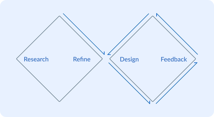
In applying The Double Diamond method, my design approach began with a comprehensive style review during the research stage. This critical assessment ensured a solid foundation for subsequent design decisions. Through iterative cycles from design to feedback, I continually refined our new dark mode style.
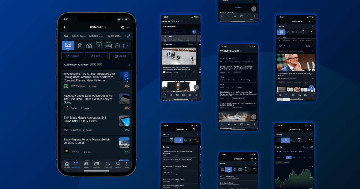
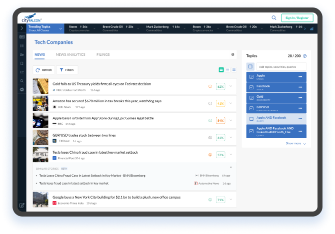
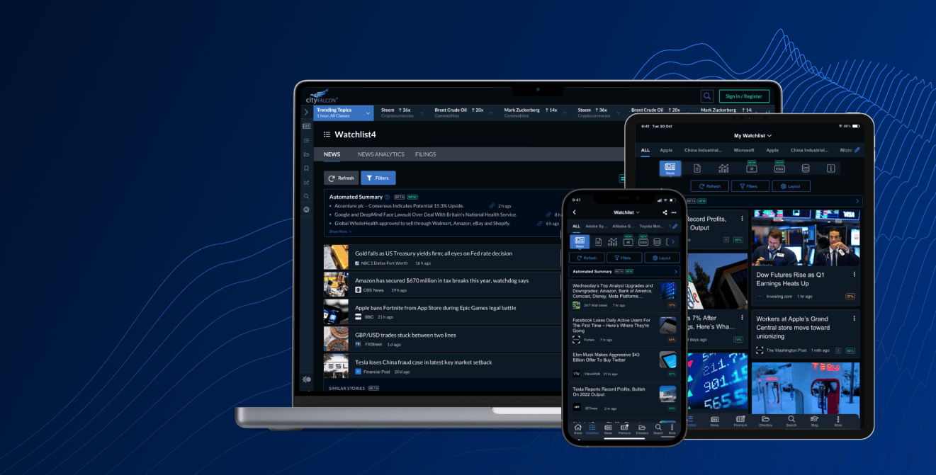
At this stage, I evaluated the existing styles and design system. I started the analysis with our main Watchlist page, which incorporates the most important elements of the product. I collected the main components and identified the critical UI components and elements that require dark mode.
Starting from colours, I could see that some styles are the result of gradual product change, where some of the elements were designed at different stages, and some haven't been updated yet. This should be kept in mind when choosing a style for the dark mode, as by the time it goes into production, some of the page elements could be different. So the process was not only about switching one colour to another: any direct colour change is too straightforward when you want to keep the visual hierarchy and contrast of objects. On the bright side, there were already some dark elements in the UI (Leftbar and Footer), which, together with the Brand logo, gave me a good foundation to start from.
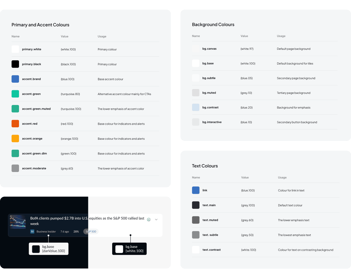
For ease of development, we adopted a principle of possibly using minimum number of colours and object styles, while maintaining accessibility and aesthetic principles.
Part of the responsibility from a design perspective was to develop dark mode not on a page-by-page basic, but rather make a coherent Design System with its Style Guides. This makes it easier to maintain and update for any further changes both for Design and Development Teams.
The key user experience factors that were taken into account when designing dark mode included:
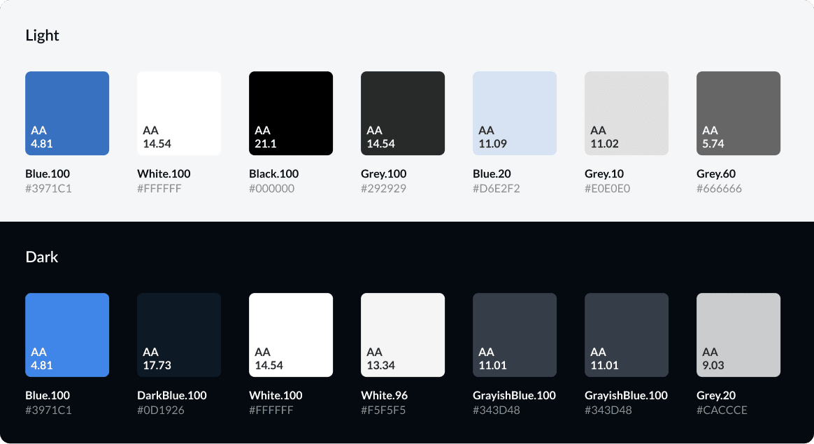
Maintaining clear and readable content through appropriate colour contrast and typography. Since the platform is data-oriented we had to make sure that headings, text, charts, tables and any important information had sufficient contrast.
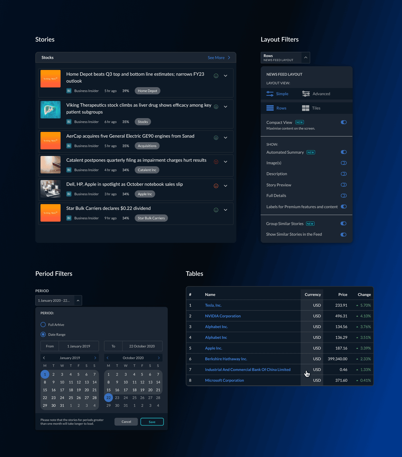
Consistency is crucial in product design to provide a coherent and familiar user interface across both light and dark modes. To maintain visual coherence across all modes, we have adapted for both Web and Mobile apps, as well as adjusted landing pages, illustrations, and marketing materials.
The dark mode is a design choice, and not all users may prefer it. To enhance the overall user experience and accommodate individual preferences, it is recommended to provide an option to switch between light and dark modes, along with user preferences for automatic mode switching based on time or device settings.
We used prototyping to assess the usability and visual appeal of the new user interface colour palette in different lighting conditions. Since the platform already has a long-term user base, it was important for the design team to receive feedback on the platform's "recognisability" given the colour changes.
Once the style guides were ready, the development team could start implementing the feature.
The general design flow now includes the requirement for any new components that are introduced to have a dark version.
.png)
The mobile version has been launched quicker, due to a shorter production cycle. During testing, there have been minor adjustments, but overall everyone was happy with the result. The solution is already being tested on web landing pages and will soon be launched for the web platform.
