A refreshed and restructured product page for a financial data provider’s News & Research API, designed to modernize the look and feel, clarify complex information, and drive conversions — all within brand guidelines. Final build was done in Webflow, fully responsive and optimized for performance.
Keep what’s working → maintain conversion momentum
Improve visual clarity, hierarchy, and trust
Align with brand typography & color system
Deliver a responsive, modern, and lightweight Webflow build
UX & Content Structure Audit
UI Design in Figma
Webflow Development (custom sections + responsive setup)
SEO & Performance Optimization
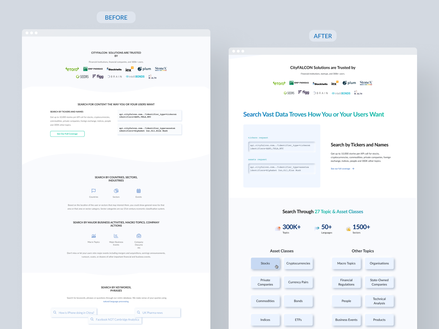
The old page had good conversion but felt visually outdated
No clear structure for different audience types
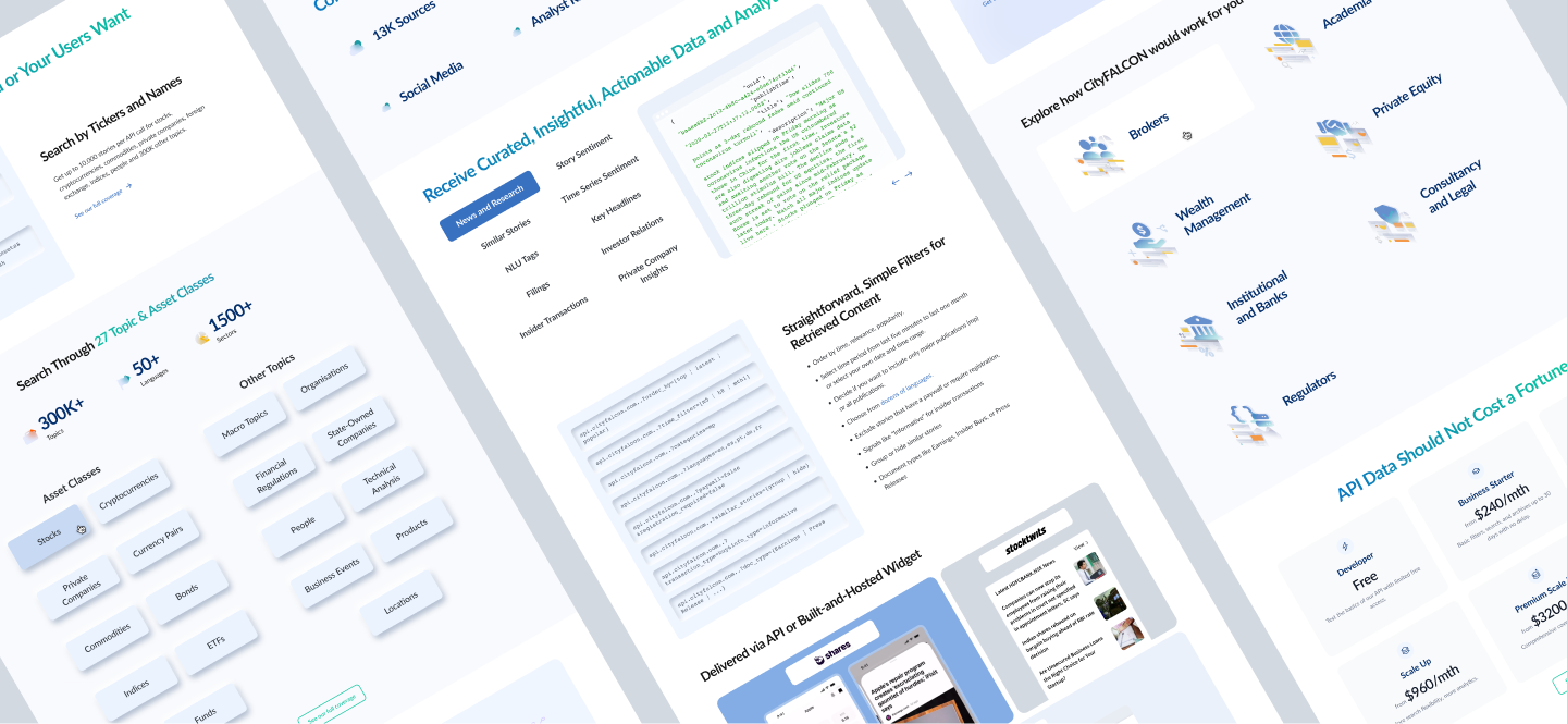
Needed to better explain how the API works, with examples
Reviewed the old page’s structure & analytics
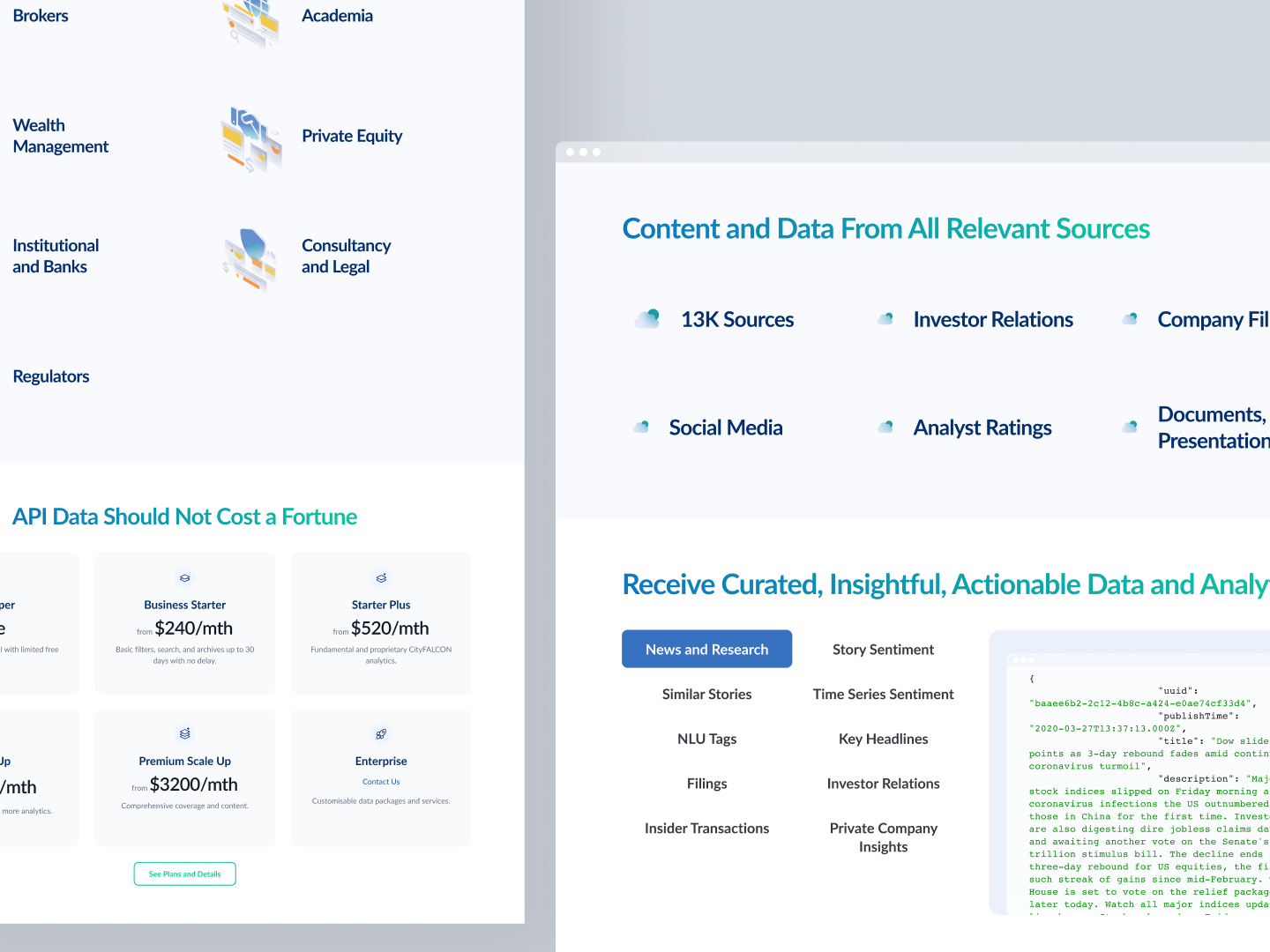
Identified missing content (use cases, integration examples, FAQ)
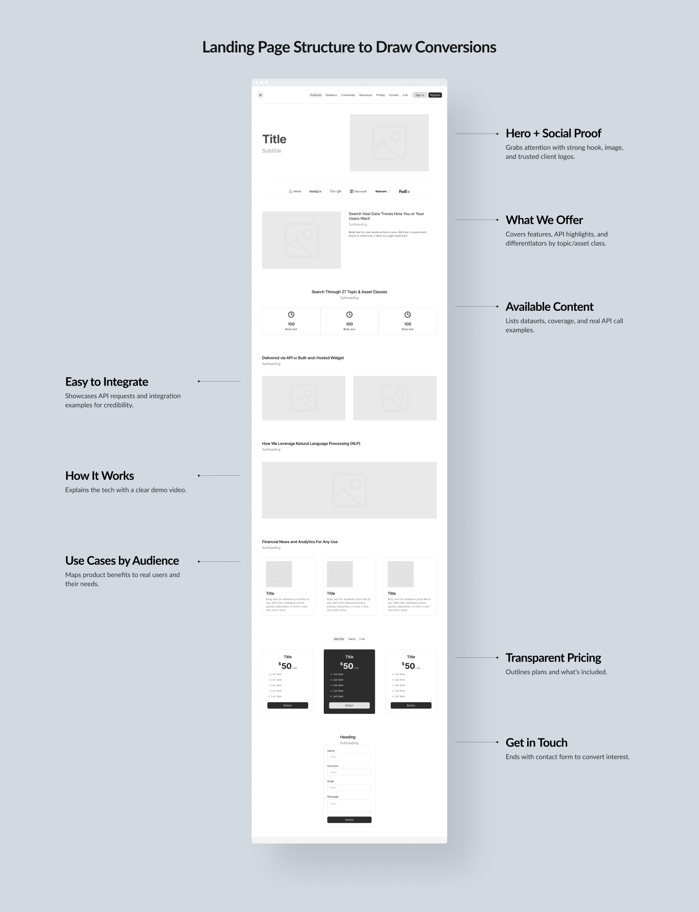
Defined a clearer narrative arc:
Problem → Solution → How it works → Proof → CTA
Updated to a cleaner, bolder visual hierarchy
Introduced new typography pairing (within brand typefaces)
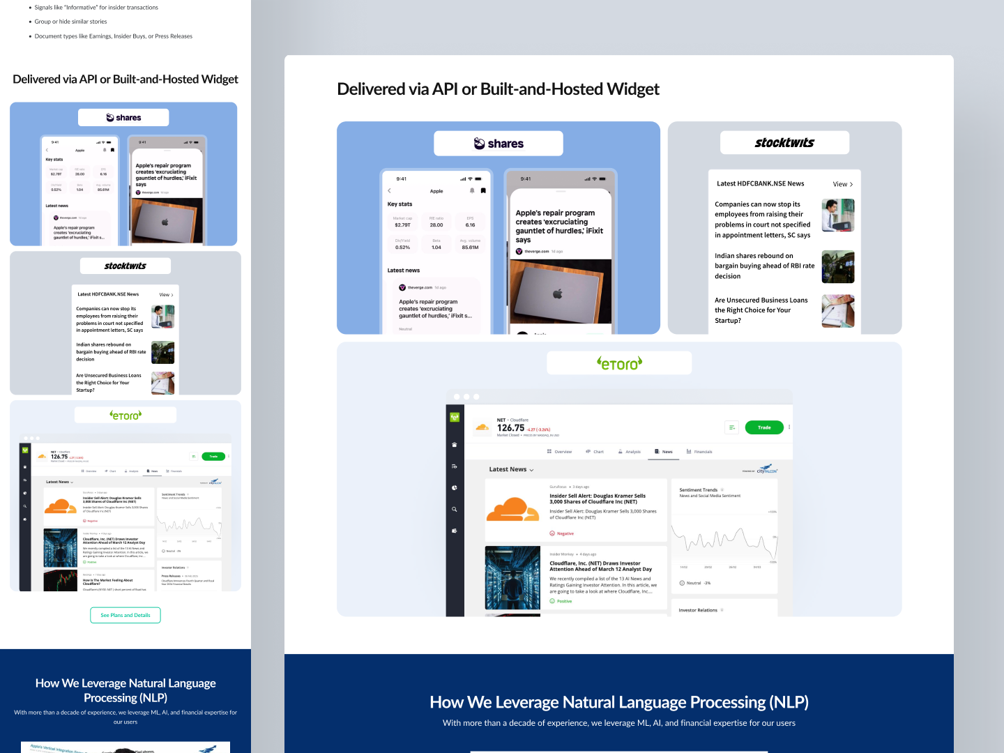
Used icons and simple visual patterns to support API feature explanation
Organized content into scrollable blocks with clear anchors
🎨 Design kept the existing brand color system
💡 Focused on readability, clarity, and decision-making speed
Built the full page in Webflow, using:
📉 Page loads under 1.3s
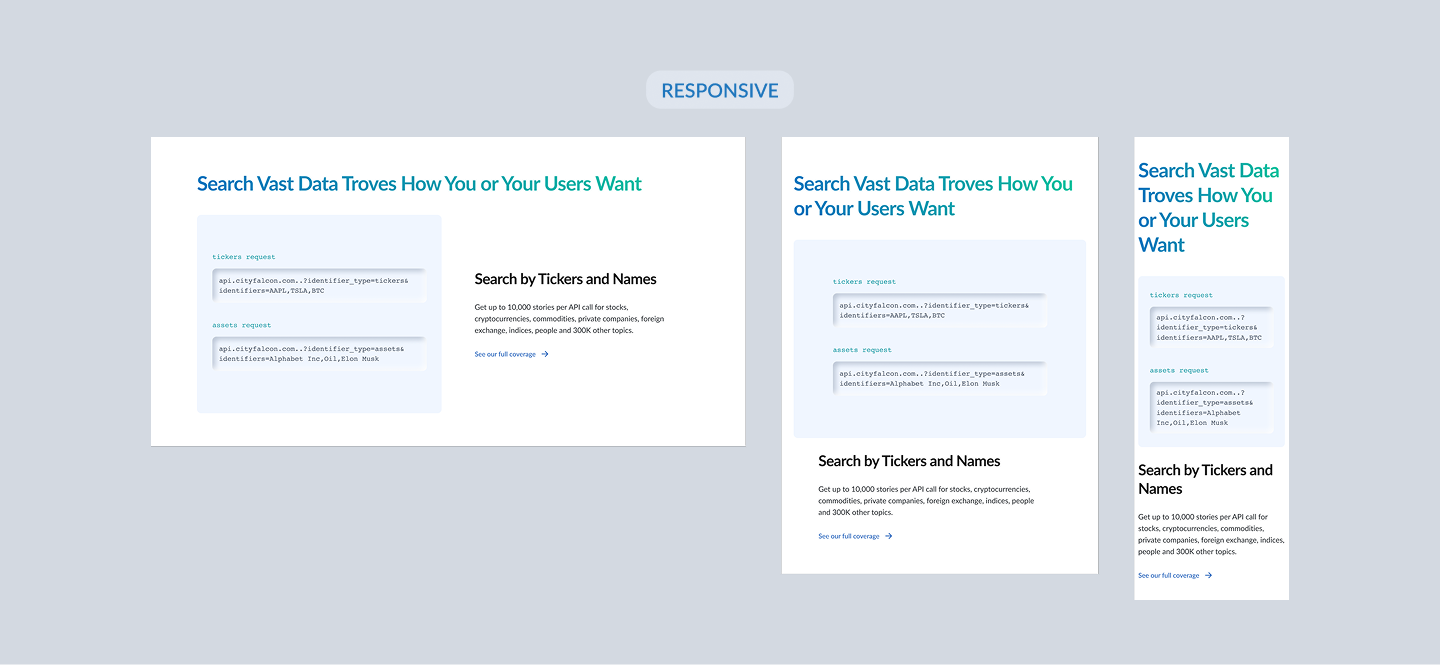
📱 Fully responsive across devices
🔎 SEO-ready (headers, meta tags, schema where needed)
Bounce rate remained stable while improving visual clarity
Visitors spent more time exploring new sections
Figma – design & prototyping
Webflow – layout, CMS, responsive design
Google Analytics, MSClarity, Pipedrive conversions – performance & behavior review
ChatGPT – content refinement & microcopy ideas