This project is part of a larger Directory platform designed to give a deeper overview of the UK private equity market. The goal was to surface key insights across fundraisers, investors, market capitalisation, and company ROI in one place. The data was extracted using advanced machine learning algorithms capable of processing unstructured sources into actionable intelligence.
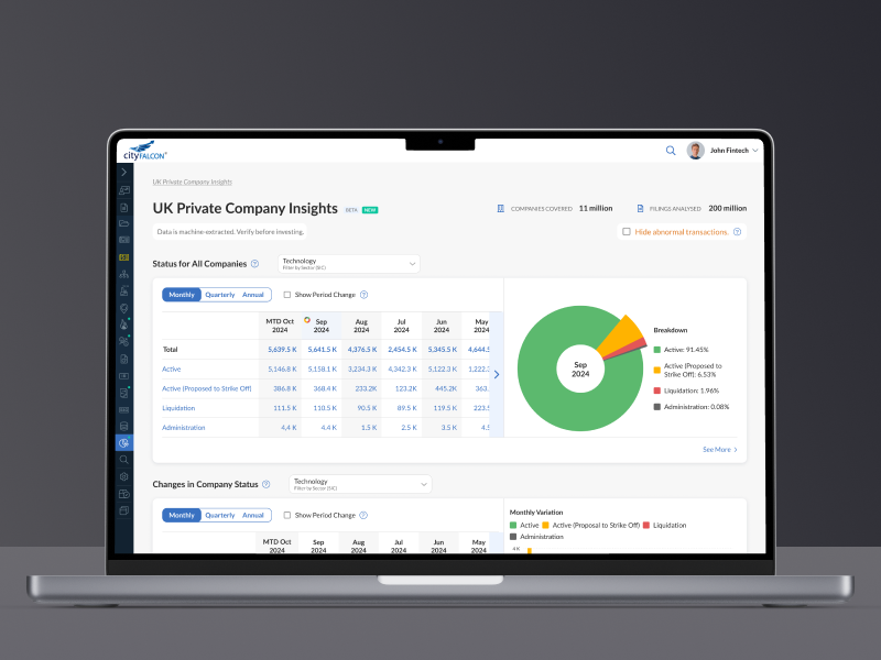
The UK Private Company Insights Dashboard provides a clear, interactive view of the UK private equity market. It consolidates multiple datasets—status changes, market cap, fundraising trends—into a single, intuitive interface.
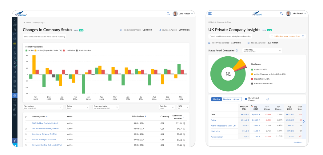
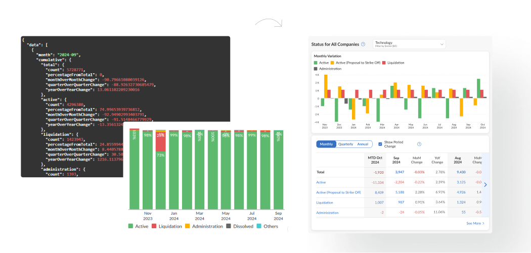
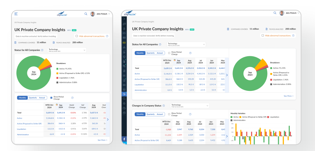
Interactive pie chart showing real-time company status breakdown
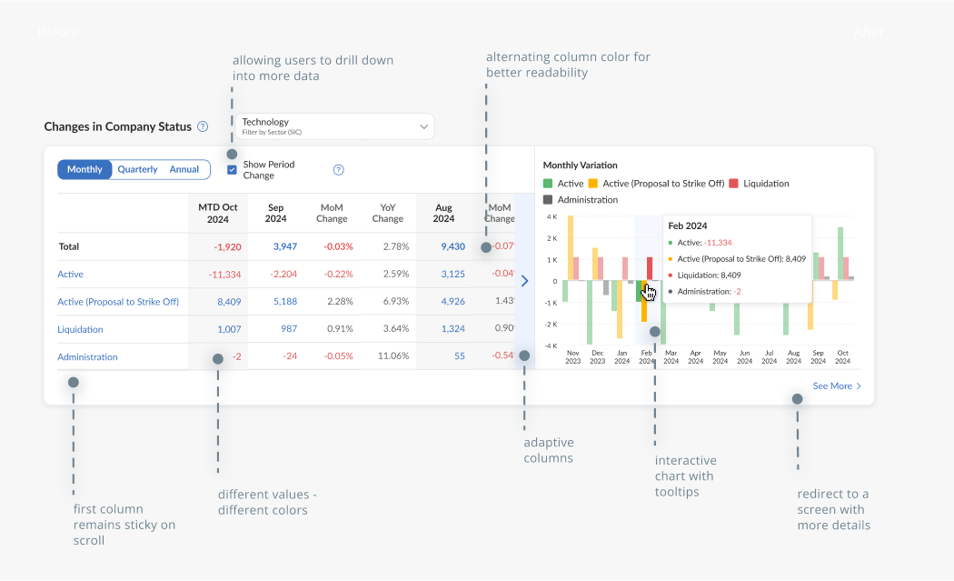
Stacked bar chart for monthly change trends (positive & negative)
Table-driven interactions – click a month to update chart views
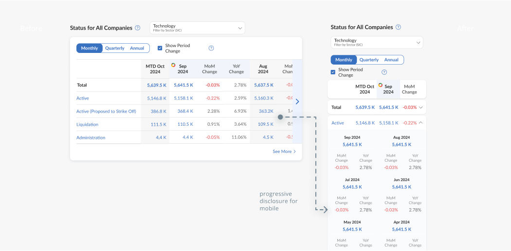
Fully responsive UI that scales across mobile, tablet, and desktop
Scalable design system to support future growth of the insights platform
Machine learning algorithms extract complex company data, transforming it into easily digestible visuals. This enables investors, analysts, and corporate strategists to quickly identify patterns and make data-driven decisions.
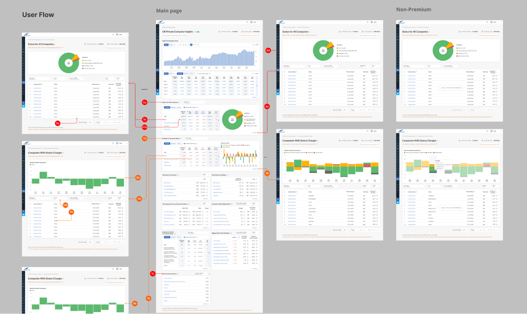
From landing on the dashboard to exploring detailed status changes, every interaction was designed for efficiency. Clicking on table months dynamically updates the pie chart, maintaining a tight data-to-visual connection.
A user flow that shows how user (e.g., an investor or analyst) goes from: Opening the dashboard →Selecting a company status →Comparing monthly data →Drawing conclusions for action
Created with accessibility and clarity in mind, the table supports sorting, filtering, and quick status comparison. Integrated visual indicators enhance readability for month-over-month and year-over-year changes.
Optimised for desktop and mobile, ensuring consistent functionality and visual clarity across screen sizes.
A cohesive, scalable dashboard that connects multiple data streams into a single, user-friendly interface—enabling better, faster decision-making for market participants.
The dashboard helps users:
Research: Chat GPT, Claude
Design: Figma